


In this series, we have previously explored how to use whitespace and typography to make your PowerPoint presentations more beautiful and easier to read. But how about colour? Why is it important? How can you use it effectively in your slides and what not to do?
A lot of organisation will have a template with corporate colours that must be used for all presentations as part of the branding strategy. But there will be times when you need to develop your own colour palette. If you feel stuck head to Adobe Color CC, one of the best tools available for presentation designers when selecting colour schemes.
Here are some tips on how to use colour effectively in presentations. If you stick to these 5 simple rules you can make your slides really stand out in no time.
Consider the meaning of colour
All colours carry meaning and evoke certain emotions. For example, red represents passion, excitement and energy but also means 'stop' or implies an error. Green represents nature, health and environment but also implies 'green light' or 'success'. Blue represents security, harmony, peace or cleanliness. Yellows represent sunshine, energy and optimism, but it’s the hardest colour on the eyes. Purples represent power, elegance and royalty. Whites represent innocence, purity and goodness. And so on, and so forth.
Hence, when you select your colour scheme for a presentation be mindful of what emotions your colours will evoke. For example don't use red if you are trying to evoke calm and peaceful emotions, use light blue or green instead.

Using colour for emphasis
Do you remember the rule: “If you make everything bold, nothing is bold”?
This applies to colour as well.
Consider the example below. If you made the whole sentence orange nothing would stand out. By changing the colour of just the words you want to emphasise, the eye goes to where you want it to go.

Another effective technique is to colour your bullets. This simple tweak will look good and better guide the reader's eye from line to line. You can also try making the active bullet a different colour to reinforce what yo are talking about.
You can also try inserting your bulleted content into shapes, using colour blocks to visually separate them. In this way you can control the flow of visual information by highlighting the different sections of a slide.

Be mindful of (bad) colour contrast
One of the most common mistakes is to select the text or graphic colour which does not have enough contrast against the background colour. Poor contrast makes text difficult to read, graphics hard to understand and might make your audience lose interest and drift off. Ensuring that text and other important presentation elements have adequate contrast is one simple thing you can do to improve the accessibility and legibility of your presentations. Quite simply put, if viewers have to strain their eyes to read anything you’ve made a poor colour choice.

Image source: CNUN
The usual approach is to choose a dark background with light text and graphics or a light background with dark text and graphics. The further apart the colours are the more contrast they will have and the easier it will be for audiences to see the text or graphic you are using. A good visual trick is to use a background colour that accepts both white and black font colours.
If you are not sure if the colours you decided on are right use a contrast colour checker, for example a free online tool or a Powerpoint add-in. These tools will let you test the colours using the two international standard tests for colour contrast and warn you when the contrast between the colours is too low for the text to be legible.
Use your colours consistently
Once you have decided on your colour palette, use it consistently throughout your entire presentation so that the same colours are used on every slide. This will add to the visual unity of the presentation and make it more cohesive and sleek. It will also build a colour association with your audience and help them remember your presentation or brand.

Image source: Dribble
Keep it simple
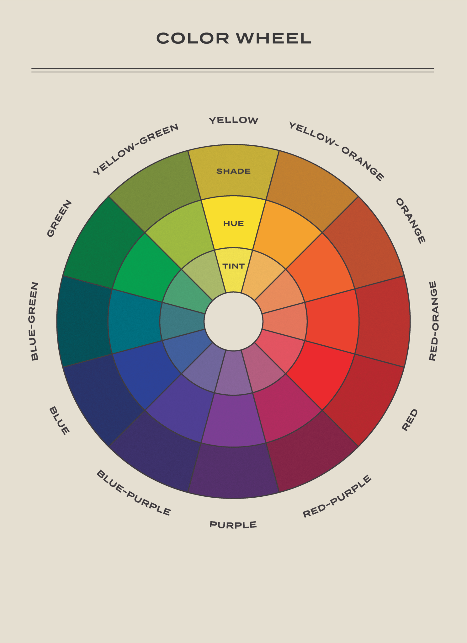
If you want to create a sleek, professional and cohesive look in your presentation go for a simple and balanced colour scheme which does not include more than 3 colours. For example, choose one accent colour and otherwise use white, black and grey. If you are feeling more adventurous choose two shades, hues or tints of the same colour (excluding black and white) and then select the third accent colour which is at least three spaces away on the colour wheel.
Another rule for balancing the proportions of colours in presentation and design is called the 60-30-10 rule. According to this rule, once you have chosen your three colours, you should use the primary colour for 60% of the elements on the slides, the secondary colour for 30% of the elements, and the accent colour for 10% of the elements.
Do you want to know more?
22 Best PowerPoint Color Schemes to Make Your Presentation Stand Out in 2022
How To Make a Presentation Part 2 - Choose the Best Color For Your Slides - Video
How to Choose Colors (Easy 3-Step Process) - Video
Color Tools for Designers 2019
Color Space - another handy tool for creating a colour theme
/Passle/53d0c8edb00e7e0540c9b34b/MediaLibrary/Images/2026-01-12-10-16-56-904-6964ca18ab784af100f11853.jpg)
/Passle/53d0c8edb00e7e0540c9b34b/MediaLibrary/Images/2026-07-21-10-39-42-108-6a5f4c6e1b7078c1ea9a91c2.png)
/Passle/53d0c8edb00e7e0540c9b34b/SearchServiceImages/2026-07-20-20-37-04-810-6a5e86f0cd3647bbc21ed952.jpg)
/Passle/53d0c8edb00e7e0540c9b34b/MediaLibrary/Images/2026-07-06-08-56-45-472-6a4b6dcdd2243d3e7116031c.png)
/Passle/53d0c8edb00e7e0540c9b34b/MediaLibrary/Images/2026-07-03-09-51-24-339-6a47861cff59a685f0e37e70.jpg)